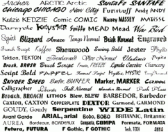
 At the end of last year, we looked at the effect of color in business to motivate customers to pay. But, that got us thinking: does font also have an effect on businesses when they receive their invoice?
Typographers have spent a great deal of time studying fonts and design. From an everyday user perspective, there are always going to be fonts that are more appropriate for the body of documents and fonts that are specialty fonts meant for headlines and banners. But how do you decide what to use?
Legibility
If the font is not legible, it is going to be difficult for the reader to understand what is being said. Experts have argued for several decades on which font family is more legible: sans serif or serif text.  There have been over 70 studies on the debate of serif vs. sans serif, most of them contradicting one another. There is a great preview of several of the studies here: http://alexpoole.info/blog/which-are-more-legible-serif-or-sans-serif-typefaces/.
The conventional wisdom on the argument has been that serif fonts are more readable, while sans serif fonts are more legible. Many people feel that sans serif fonts look cleaner and more modern, while serif fonts look more traditional. That would imply that large blocks of text would be easier to read in serif fonts, while small sized font would be more legible and easier to read in sans serif fonts.
Considering that many of the studies require aesthetic preference, we suggest selecting a font family that brands your business and keeping it consistent throughout all of your marketing material.
Hierarchy
Every invoice needs hierarchy of text to help readers define how they should read the content. This also helps readers navigate by browsing and scanning, which is necessary when invoicing because you want the customer to know that:
- The document they are receiving is a bill.
- How much it is for.
- When it is due.
- What the payment methods are.
Contrast
 It goes without saying that the optimal color contrast between paper and font should be black font on white paper. Contrast is a core factor on readability and if your customer cannot read that they owe you, then they will not be sending you a payment anytime soon.
White Space 
Do not overcrowd your invoice with too much information. Examine your current invoice. Is there anything that you could take out of it? In content-heavy documents, spacing and the use of white space around the font contributes to the readability of the document.
What does this all mean?
While there has not been significant research done on fonts used on invoices, we can look at the elements of typography design and follow the best practices to increase legibility and readability. Remember, an appealing yet minimal design will make receiving the invoice a more positive experience.

Everything is very open wioth a really clear description of tthe issues.
It was definitely informative. Your site is very useful.
Many thanks forr sharing!